 Remember those eye charts from the optometrist’s office where one had to cover one eye and pick out which line could still be read? The smaller the better, right?
But that is decidedly not how one wants the reader to view a sign! Not everyone has 20/20 vision or binoculars available.
It is tough enough to compete in today’s world for customers. Making one’s signs tough to read or unattractive compared the rest of the crowd is foolish. Who designed your sign? Did you allow your sign professional to help you choose a font? Did you choose a font based on how much you liked it in front of you on a computer screen or a piece of paper? What color did you pick?
Font size is critical. If you don’t have the space you need for a sign or the space is very limited, then you really have to decide just what it is that you want to convey to the viewer. Maybe you only have enough room for your company name or the office occupant’s last name or that there is a sale going on. Trying to add too many modifiers to further explain can reduce the overall font size to the point where it really can’t be read unless one is up close.
I saw a good one the other day. It was a banner indicating that a certain firm was “coming soon” to the building on which it was draped. The banner was smaller than the old sign that was already on the building and did not even cover that. Then the author of the banner used a script that was rather small and really could only be read if one was in the parking lot, in front of it and only 10 feet from the building. If you were on the road going past the building a hundred feet away….well, you get the message.
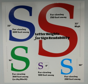
There are a few guidelines that are published and differ slightly from one to another, but in general here is what one must consider:
| DISTANCE | RECOMMENDED HEIGHT |
| 40 FEET | 4 INCHES |
| 80 FEET | 8 INCHES |
| 100 FEET | 10 INCHES |
| 150 FEET | 15 INCHES |
| 180 FEET | 18 INCHES |
| 240 FEET | 24 INCHES |
| 360 FEET (ABOUT A CITY BLOCK) | 36 INCHES |
| 420 FEET | 42 INCHES |
| 480 FEET | 48 INCHES |
Besides font size, one has to consider the readability of the font. Fancy swirls and scrolls may look good on a novel’s front cover, but does one think that Old English text or Old German style text is easily read on a billboard, for example? Even in Asia, there has been discussion over the years of streamlining Chinese characters a bit in order to make them more easily readable.
Take a gander at this text example:
![]()
(I made this name up; so hopefully, I am not treading on anyone’s toes!)
Pretty simple, eh? Not plain text, not block letters, but readable and interesting. Now look at it this way:

And in bold script:
![]()
That Edwardian Script is much prettier, but as far as being easy to read at a drive by glance where your sign is competing with others for attention, you might want to make it more impactful and change the font style. If someone is walking by, they may stop just to read it, but do you want to depend upon a person being within a few feet of your sign to stop and read it, because they are curious as to what it says? Or do you want to grab their attention for a greater distance?
Now let’s see the Edwardian Script in a pastel over a pastel – and yes indeed, there are signs like this out there (I even borrowed the colors):
![]()
A sign can be very beautiful and pleasing to the eye and one’s sense of art, but that doesn’t make it a good sign. It should not resemble one of those color vision tests at the optometrist’s office. It certainly doesn’t have to be boring and only bold black print over a white background all the time, either. If one must be standing two feet away and deliberately admiring it, what good is it as a sign if the targeted audience is much farther away and cannot read it?
Give us a call. We’ll walk you through the process by starting with a site survey and some questions about just what message you want to convey. We’ll listen and provide the best options for your budget.